[ Home ] [ Up ] [ Introduction to Excel ] [ Entering a Range of Data ] [ Formatting Cells to Match Data Types ] [ Cut, Copy, Paste and Move Data ] [ Inserting and Deleting Rows and Columns ] [ Entering and Replicating Formulas ] [ Using Simple Functions ] [ Producing Charts with Labels ] [ Printing Selected Areas ]
Producing Charts with Labels
Vocabulary
Creating
a Chart
Resizing
Your Chart
Moving
Your Chart
Changing
Style and Colour of Chart Background
Changing
the Plot Area Background
Changing
the Data Series Format
Changing
The Chart Type
Changing
The Series Source Data
Changing
Chart Options
Changing
the Location of Your Chart

Vocabulary
Chart:
A chart is a graphical representation of a set of data. It can look like a
line graph, a bar chart, or a pie chart for example.
Data Series:
A group of related data. In a chart each data series will have its own
colour.
Creating
a Chart
- Select the range of
data you wish to include in your chart.

- Click the chart wizard
button on the Standard Toolbar.
Step
1: Chart Type Selection
- Select the type of
chart you wish to use.
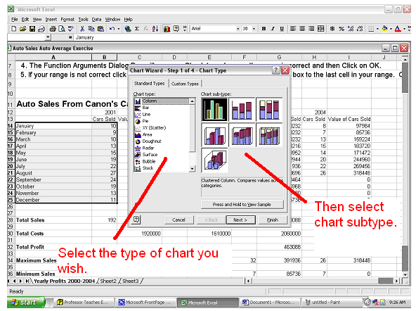
- When finished with
this step click the next button.
Step:
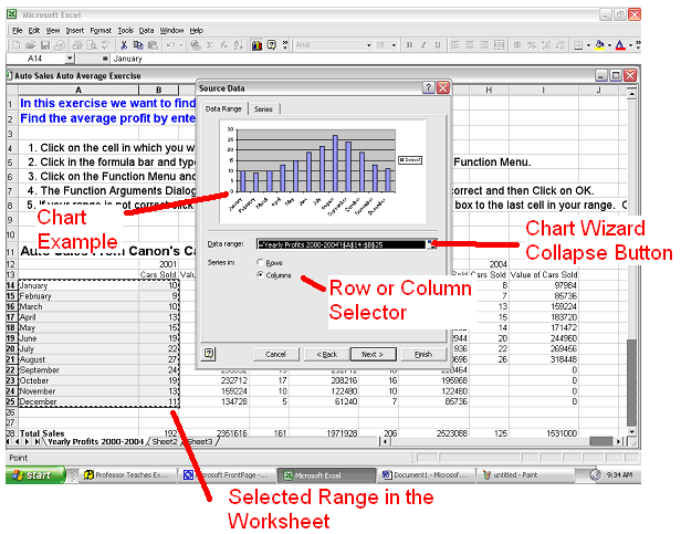
2 Source Data Selection
- In the next step you
will see an example of your chart. Check to make sure that it looks
correct and that the range is correct. If the range is not correct
type the correct range in the data range field or click on the wizard
collapse button and then re-select your range.
- In this step you can
also choose if you wish your data series comes from the rows of your
spreadsheet or the
columns.
- Click on the Series
tab and in the Name field type the name for this series of data.
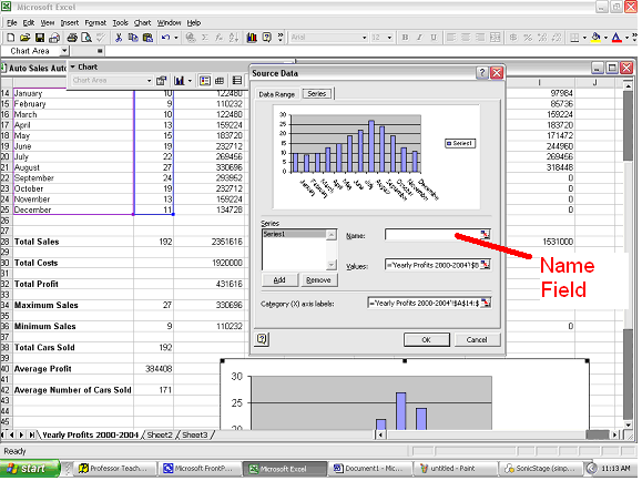
- The Category label
section of the chart wizard is where you can choose the names for your chart
legend. Click on the collapse
button.

- Highlight the data
names you want to use in your legend then click on the collapse button
again.

- When finished with
this step click the Next button.
Step
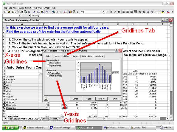
3: Chart Options
- Type titles for your chart, x
axis, and y axis in the corresponding fields in the chart wizard.
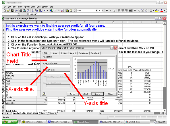
- Click on the Gridlines Tab then choose
which gridlines you want to be presented in your chart.
- Click on the Data Labels Tab then
click on the various options to decide if you want the corresponding labels
to appear on the chart.
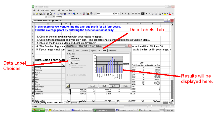
- Click on the next button when you are
satisfied with your chart.
Step
4: Chart Location
- Choose if you want your chart to be
displayed in the worksheet the data came from or in a new
worksheet.
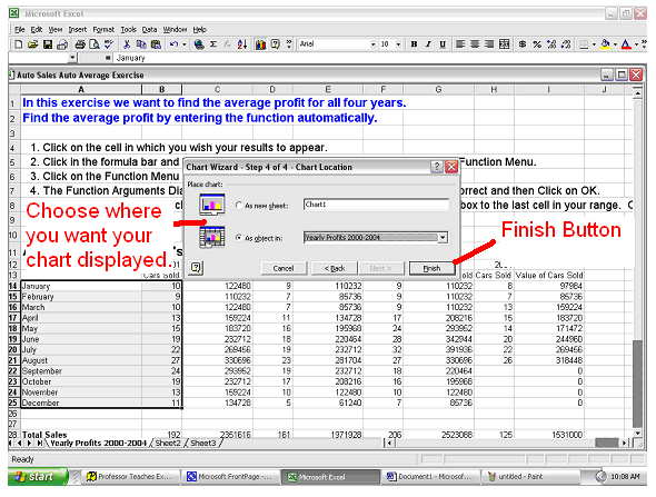
- Click on the Finish button.
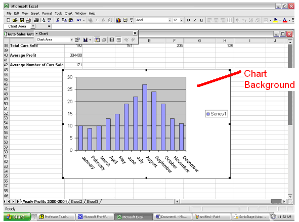
Resizing
Your Chart
If you want to work with your chart it
must be selected. You can always tell if you chart is selected if border
and sizing handles are
visible.

To resize your chart follow these
instructions:
- Click and hold on a sizing handle.
- Drag the chart to the desired size.
- Release the mouse button.
Moving
Your Chart
- If your chart is not already selected
then do so.
- Click and hold anywhere on the the
chart background.
- Drag the chart to a new location.
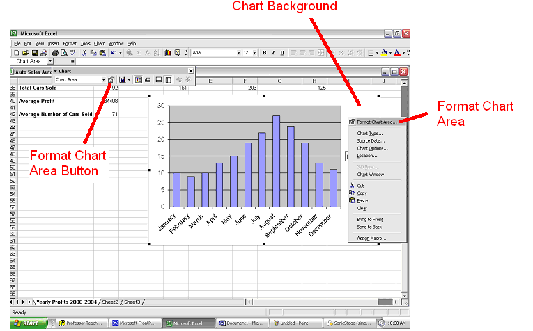
Changing
Style and Colour of Chart Background
- Right-click on the charts background
and select Format Chart Area. Or choose the Format Chart Area button
from the chart toolbar.
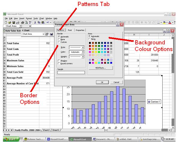
- Click on the Patterns tab and choose
the border style and background colour.
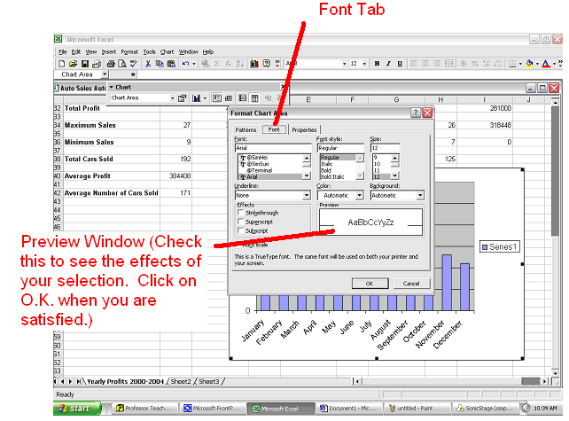
- Click on the Font Tab and choose from
the various options presented to you.
Changing
the Plot Area Background
- Right click on the plot area
background and select Format Plot Area.

- Choose the border type and background
colour you wish.

- Click OK.
Changing
the Data Series Format
- Right click on the data series you
wish to format and click on Format Data Series.
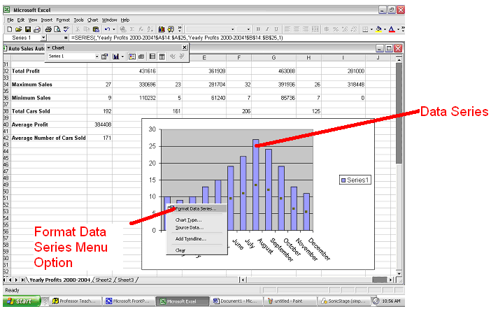
- At this point the only tab you are
going to want to use is the Patterns Tab. In this area you can choose
the colour or border options for your data series.
Changing
The Chart Type
If you wish to change the type of chart
you are using then do this:
- Right-click on the chart background
and select the Chart Type option.
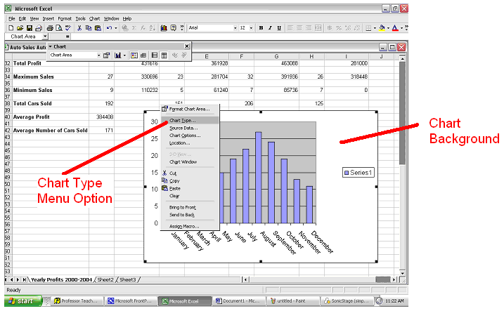
- Once done this will take you back to Step
1 of the Chart Wizard. Click on the hyperlink to see how to change
your source option. Click on OK when finished.
Changing
The Series Source Data
If you want to change the data from which
your series is being drawn follow these steps:
- Right-click on the chart background
and select the Source Data option from the drop down menu.
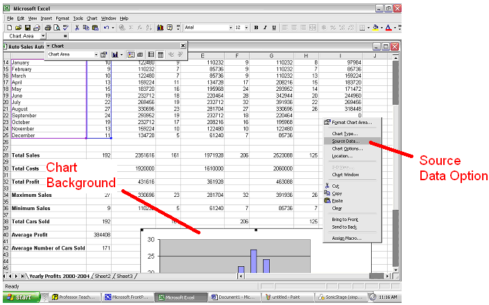
- Once done this will take you back to Step
2 of the Chart Wizard. Click on the hyperlink to see how to change
your source option. Click on OK when finished.
Changing
Chart Options
If you want to add in titles or gridlines
you can do this with these guidelines.
- Right-click on the chart background
and choose Chart Options from the drop down menu.

- Doing this will take you back to Step
3 of the Chart Wizard. Click on the hyperlink to see how to change
your Chart Options. Click on OK when finished.
Changing
the Location of Your Chart
If you want to change the location of
your chart (i.e. if the chart is embedded in the same worksheet or a new
worksheet) then follow these instructions:
- Right-click on the chart background
and select Location from the drop down menu.
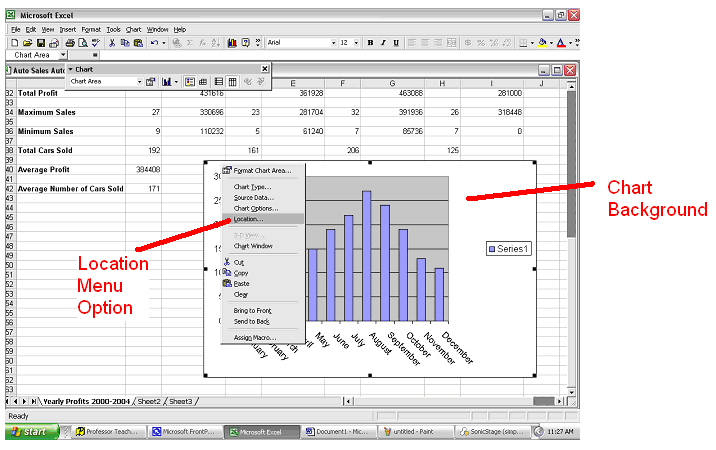
- Doing this will take you back to Step
4 of the Chart Wizard. Click on the hyperlink to see how to change
your Chart Options. Click on OK when finished.

